Daily UI Challenge
2023
1 Month
#N/A
Introduction
During this 30 day challenge I was supposed to get an email every day, in order to know what to work on. After day six I didn’t receive anything, so I sent an email asking what happened. I didn’t get any response, so I started thinking of ways on how to continue this challenge.
Found the remaining days online and decided to complete the challenge my own way. I chose to use the first ten days of the challenge to redesign the current website of dailyui.co. It appeared to me that there were some areas where improvements could be made.
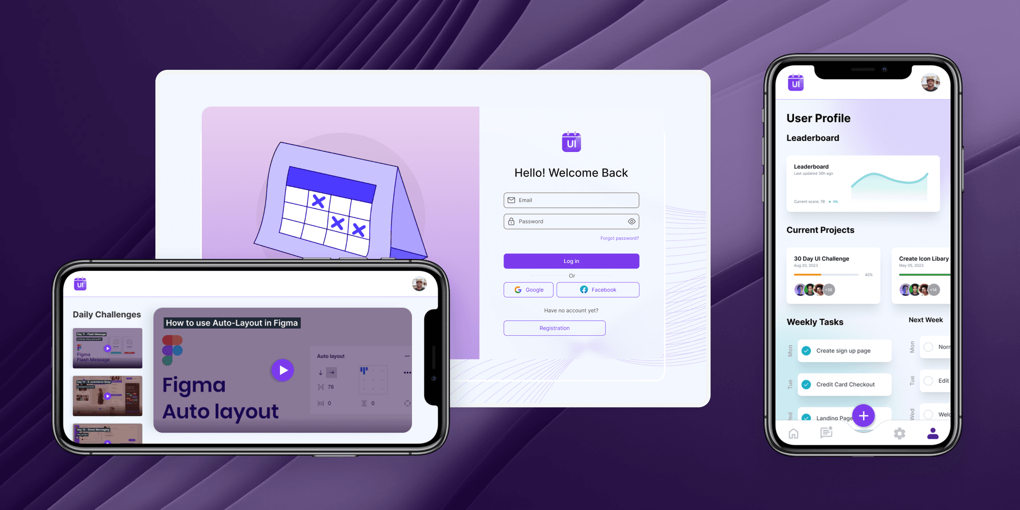
I created new pages for the specific challenges. Rather than sending out tasks everyday by email I wanted to add to create this new platform. The idea behind the new platform is that users can watch daily instructional videos, submit designs and track scores instead of simply receiving an email and showcasing it on behance.
Preperation
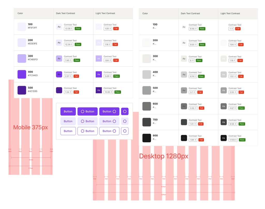
As this challenge was going to take a while to complete I decided to create a basic color scheme, typography, button layout, and grid beforehand. I chose only to go with a primary color and neutrals as I was not designing the full end product. I picked purple as it could stand for creativity and fantasy.
Sign In
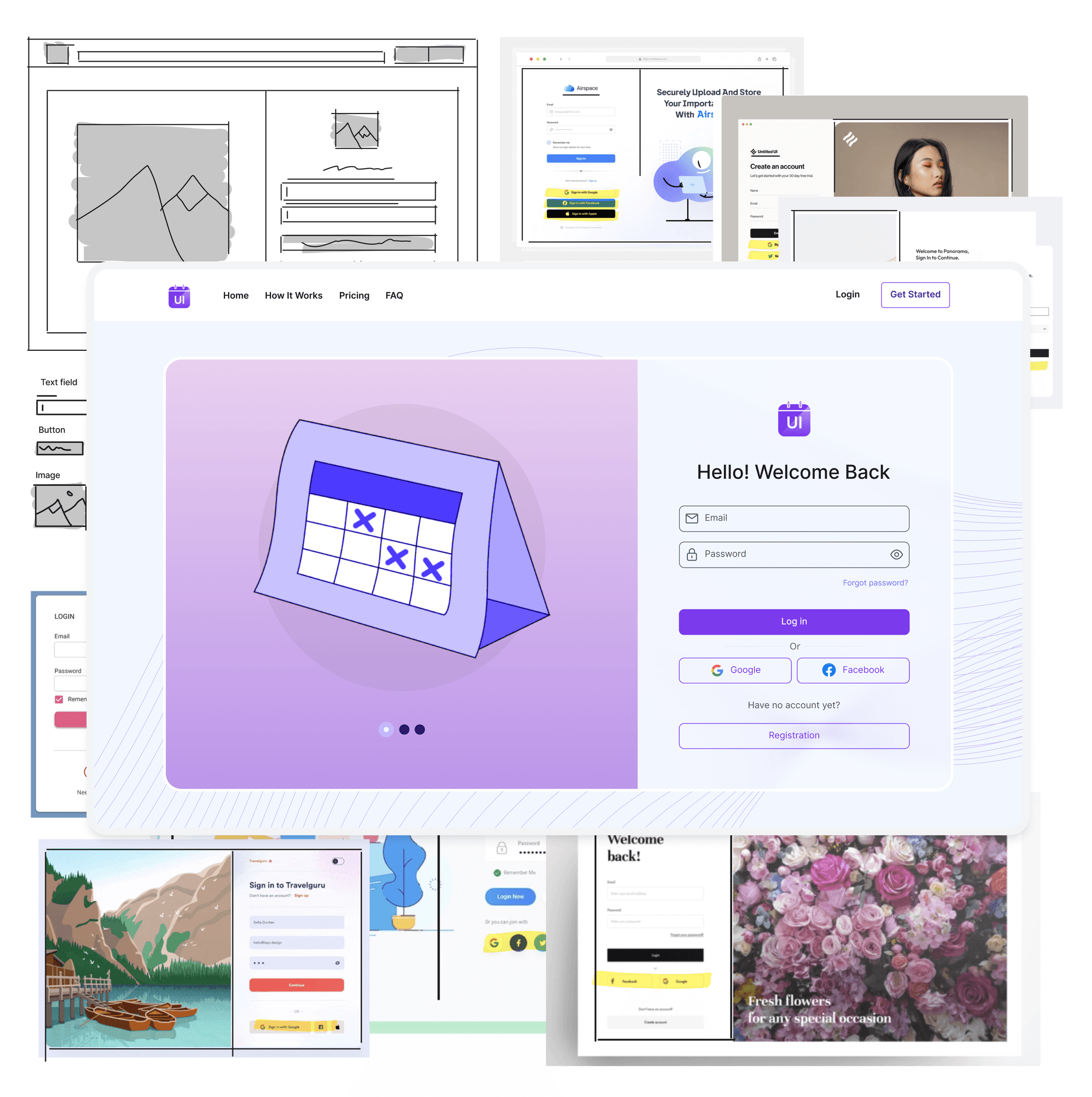
I began by researching best practices. After gathering insights I sketched out some ideas to explore layout, form fields, and button placements. Next I created some wireframes to define the structure and hierarchy of some of the pages.
Credit Card Checkout
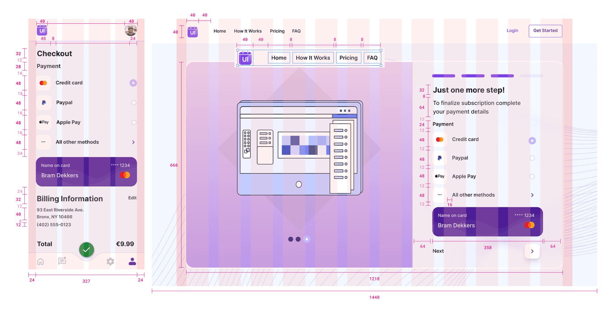
I aimed for a clean and user-friendly layout for entering credit card details. It was neccesary to ensure that the design worked seamlessly on various devices, so I worked on a desktop and mobile version. By adding an actual credit card in the design I wanted to distingiush from other payment pages. Added some redlines to showcase the use of the 4px rule.
Landing Page
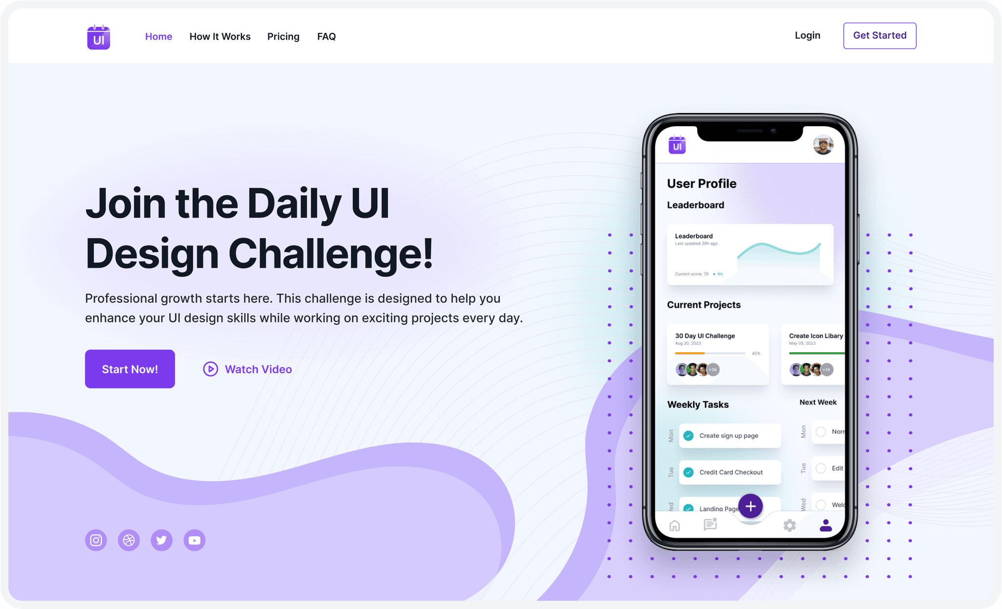
My approach for the landing page challenge began with a clear understanding of its purpose: product promotion and lead generation. In addition to that I added a mockup to visualise it’s available on mobile and I added an option to watch a video in case the text wasn’t sufficient. On all pages I tried to align with the brand identity.
Flash Message
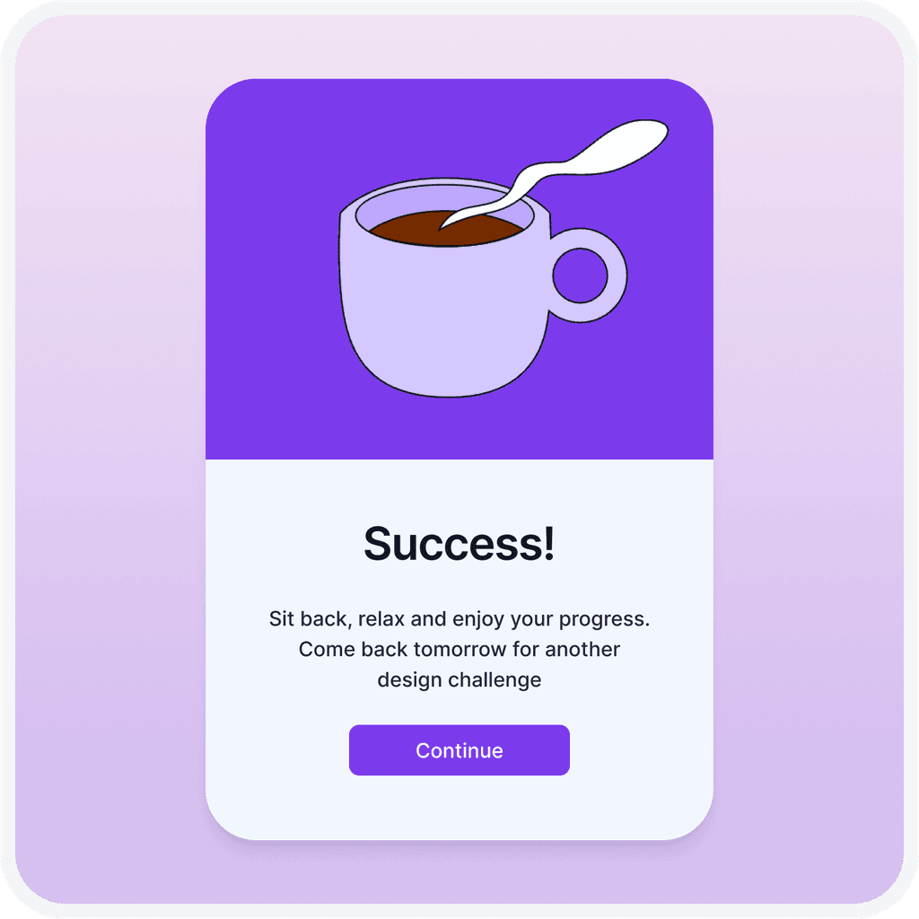
Next up was originally the design of a calculator. But as this felt way out of context here I decided to be replace it with the next task in line (day 11), which turned out to be a flash message. I thought it would be a good idea to use a flash message to let them know that what they just did worked. In this case the flash message offered immediate feedback to an action, completing a daily challenge.


Logo
To create a memorable app logo, I began by brainstorming ideas.. I sketched multiple logo concepts and got it quite easily. Once I had the concept I was satisfied with, I transitioned to digital design, crafting vector logo with the recognisable colors of the brand. The logo effectively showcases the purpose of Daily UI, an agenda with UI included in there.
User Profile & Settings
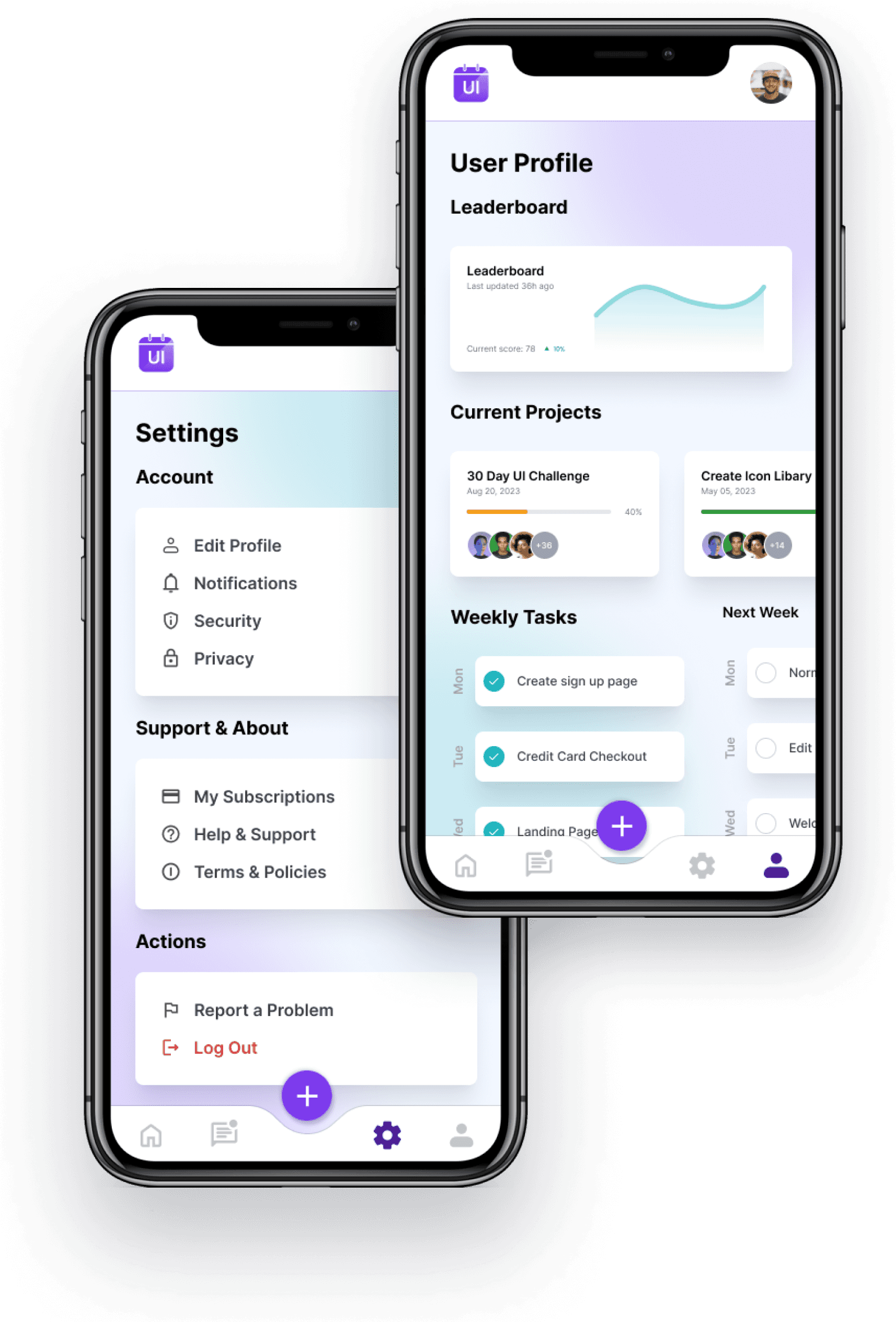
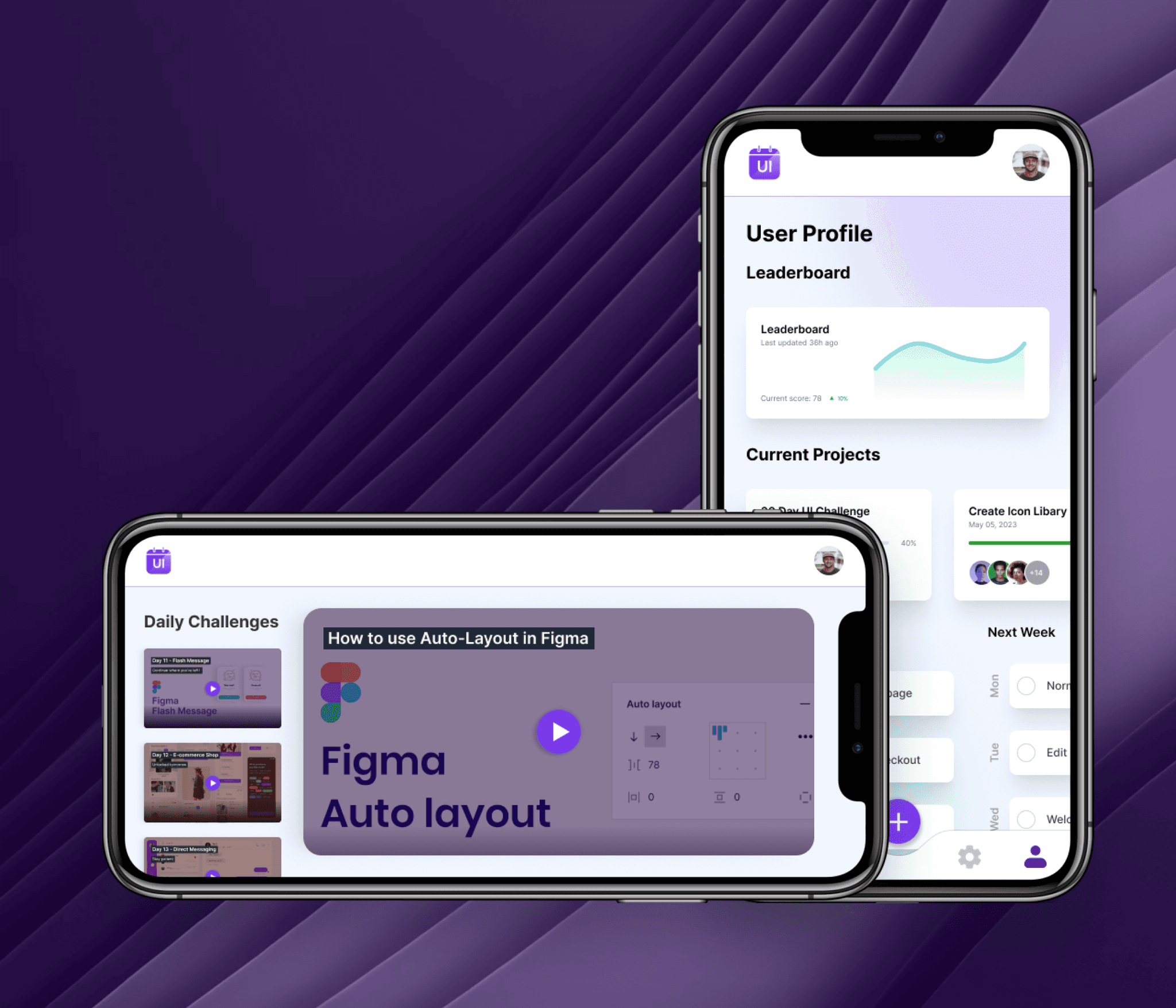
For the user profile I considered what information users would find most valuable on their profile page and organized profile sections logically. The visual design aimed to strike a balance between user-friendliness and aesthetic appeal. I've also incorporated a leaderboard section to provide additional motivation for users to return.
Creating a clear and organized settings page was my primary goal. To achieve this, I began by determining which settings were most important and categorizing them accordingly. I maintained visual consistency with the overall website design and ensured that the settings were accessible to all users.
404 Error
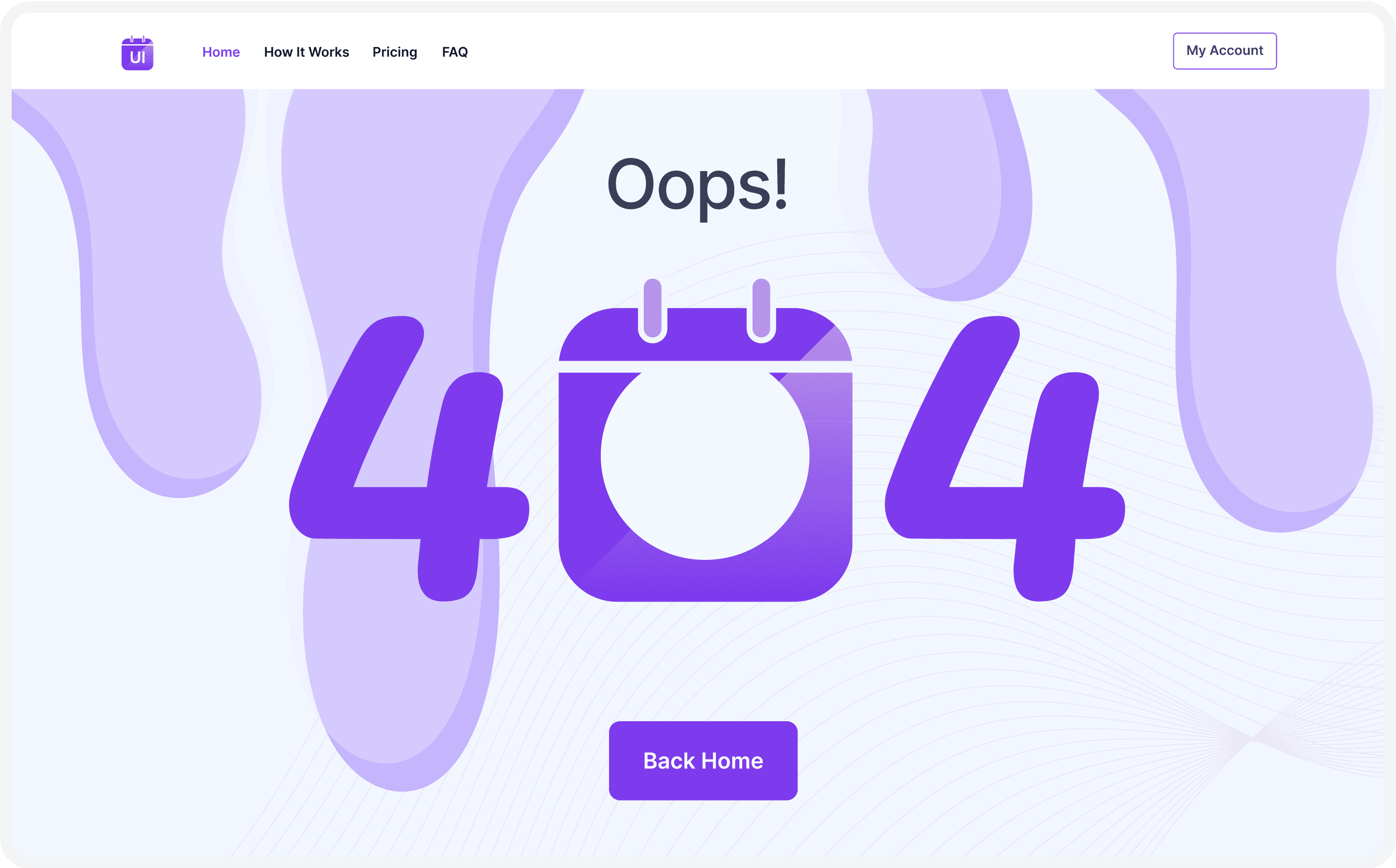
I used the 404 error challenge as an opportunity to showcase creativity. I strived to engage users through humor while ensuring that the navigation option were readily available to help users return to the main website. Additionally, I maintained consistency with the website's design and tone to uphold branding.
Videoplayer
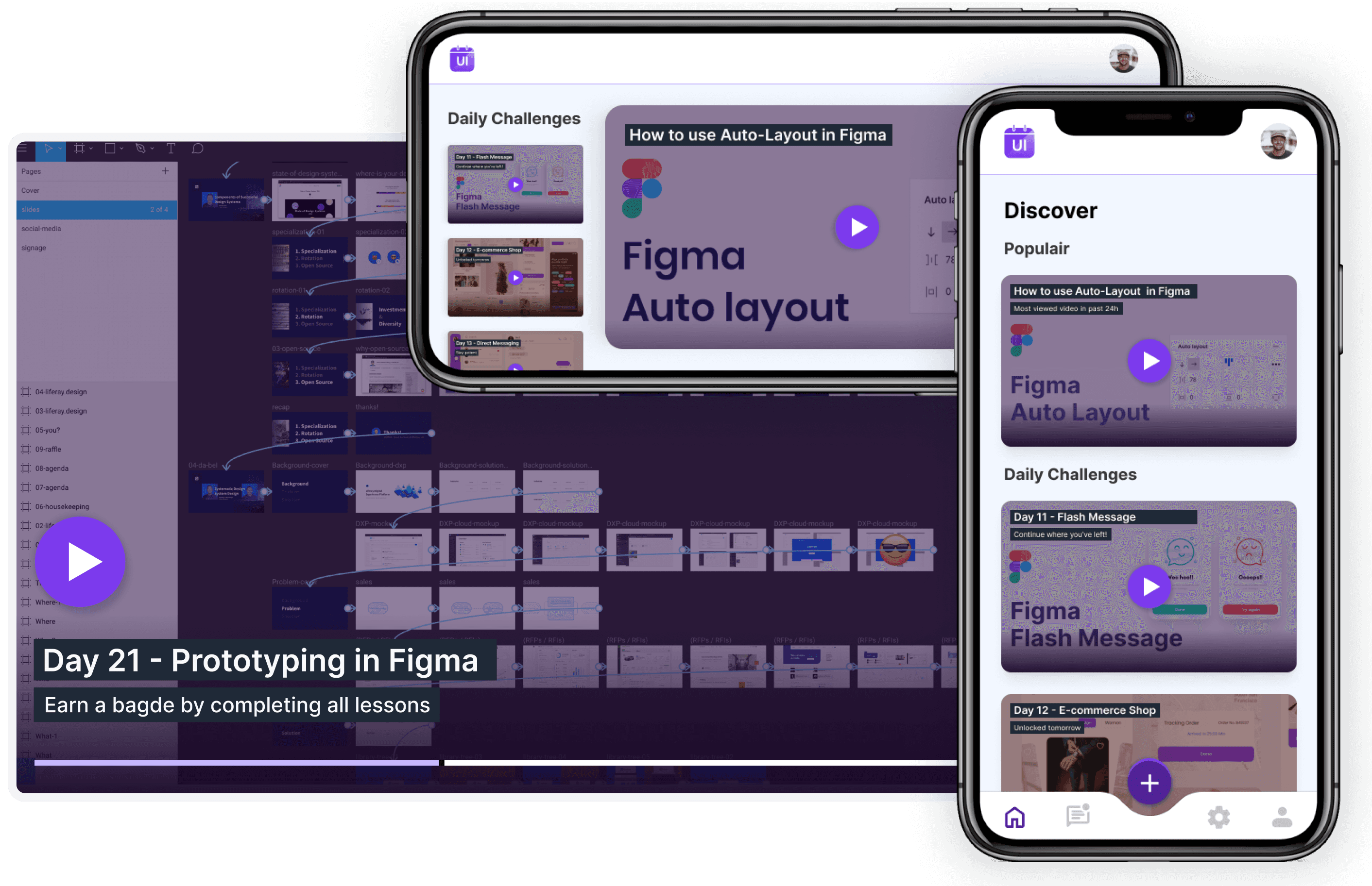
I showcased adaptability in design by switching to a more relevant element, which in this case, was a video player. I designed an attractive video player interface complete with controls and playback options, ensuring compatibility across different browsers and devices. My focus was on delivering a seamless video playback experience.
Social Share
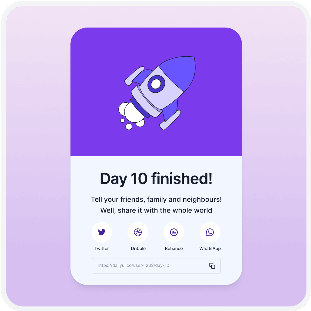
For the social share challenge, I included popular social media platforms for sharing content. My goal was to design share buttons that seamlessly integrated with the overall design while also standing out visually. I ensured that the social share functionality was user-friendly and also added an option to manually share content elsewhere.
Toolkit
Tools for my creative work



Testimonials
Alexander Kremenskoy
Senior Product Designer
"Working with Bram has been a delightful experience. He is impressively punctual, consistently delivering work ahead of deadlines. His creative designs reflect a deep understanding of our brand's vision, while his responsible approach ensures a smooth and efficient collaboration process. Highly recommended for any design project!"
Stijn Heijstee
GoRoadtrip.nl
Bram is managing our social media channels, taking care of everything from ideation and planning to design and execution. We’re excited to continue collaborating with him and highly recommend his expertise.
Georgi Davitaya
Head of Design - Career.io
"Bram’s good understanding of design principles, combined with his marketing background, uniquely positions him to address multifaceted design challenges. His commitment to deadlines, coupled with an inherent drive for self-improvement, underscores his potential as a valuable asset to any design team."
Willem Froeling
Waal | WoonSlim
Bram has completed several tasks for me, including creating documents and presentations. He has a great sense of style and works with a lot of flexibility. Bram understands when you have a quick question and need a fast response. Overall, it's been a pleasure working with him, and I would highly recommend his services!
Rolf Bax
CMO - Career.io
"Bram has been a really great addition to our team - both on personal level as well on business level - he is a really nice person to work with and developed himself really quick to a very proactive and creative designer."
Leapforce
Leapforce
We’ve worked with Bram Dekkers several times as a freelance designer and are very satisfied with his work. His smart design system ensures we can consistently publish beautiful ads and social media posts with ease. Bram combines creativity with efficiency, making collaboration seamless and results impressive. Highly recommended for anyone looking for top-notch design support!
Toolkit
Tools for my creative work


Toolkit
Tools for my creative work


Testimonials
Alexander Kremenskoy
Senior Product Designer
"Working with Bram has been a delightful experience. He is impressively punctual, consistently delivering work ahead of deadlines. His creative designs reflect a deep understanding of our brand's vision, while his responsible approach ensures a smooth and efficient collaboration process. Highly recommended for any design project!"
Alexander Kremenskoy
Senior Product Designer
"Working with Bram has been a delightful experience. He is impressively punctual, consistently delivering work ahead of deadlines. His creative designs reflect a deep understanding of our brand's vision, while his responsible approach ensures a smooth and efficient collaboration process. Highly recommended for any design project!"
Stijn Heijstee
GoRoadtrip.nl
Bram is managing our social media channels, taking care of everything from ideation and planning to design and execution. We’re excited to continue collaborating with him and highly recommend his expertise.
Georgi Davitaya
Head of Design - Career.io
"Bram’s good understanding of design principles, combined with his marketing background, uniquely positions him to address multifaceted design challenges. His commitment to deadlines, coupled with an inherent drive for self-improvement, underscores his potential as a valuable asset to any design team."
Willem Froeling
Waal | WoonSlim
Bram has completed several tasks for me, including creating documents and presentations. He has a great sense of style and works with a lot of flexibility. Bram understands when you have a quick question and need a fast response. Overall, it's been a pleasure working with him, and I would highly recommend his services!
Rolf Bax
CMO - Career.io
"Bram has been a really great addition to our team - both on personal level as well on business level - he is a really nice person to work with and developed himself really quick to a very proactive and creative designer."
Leapforce
Leapforce
We’ve worked with Bram Dekkers several times as a freelance designer and are very satisfied with his work. His smart design system ensures we can consistently publish beautiful ads and social media posts with ease. Bram combines creativity with efficiency, making collaboration seamless and results impressive. Highly recommended for anyone looking for top-notch design support!
Introduction
During this 30 day challenge I was supposed to get an email every day, in order to know what to work on. After day six I didn’t receive anything, so I sent an email asking what happened. I didn’t get any response, so I started thinking of ways on how to continue this challenge.
Found the remaining days online and decided to complete the challenge my own way. I chose to use the first ten days of the challenge to redesign the current website of dailyui.co. It appeared to me that there were some areas where improvements could be made.
I created new pages for the specific challenges. Rather than sending out tasks everyday by email I wanted to add to create this new platform. The idea behind the new platform is that users can watch daily instructional videos, submit designs and track scores instead of simply receiving an email and showcasing it on behance.
Preperation
As this challenge was going to take a while to complete I decided to create a basic color scheme, typography, button layout, and grid beforehand. I chose only to go with a primary color and neutrals as I was not designing the full end product. I picked purple as it could stand for creativity and fantasy.


Sign In
I began by researching best practices. After gathering insights I sketched out some ideas to explore layout, form fields, and button placements. Next I created some wireframes to define the structure and hierarchy of some of the pages.


Credit Card Checkout
I aimed for a clean and user-friendly layout for entering credit card details. It was neccesary to ensure that the design worked seamlessly on various devices, so I worked on a desktop and mobile version. By adding an actual credit card in the design I wanted to distingiush from other payment pages. Added some redlines to showcase the use of the 4px rule.


Landing Page
My approach for the landing page challenge began with a clear understanding of its purpose: product promotion and lead generation. In addition to that I added a mockup to visualise it’s available on mobile and I added an option to watch a video in case the text wasn’t sufficient. On all pages I tried to align with the brand identity.


Flash Message
Next up was originally the design of a calculator. But as this felt way out of context here I decided to be replace it with the next task in line (day 11), which turned out to be a flash message. I thought it would be a good idea to use a flash message to let them know that what they just did worked. In this case the flash message offered immediate feedback to an action, completing a daily challenge.


Logo
To create a memorable app logo, I began by brainstorming ideas.. I sketched multiple logo concepts and got it quite easily. Once I had the concept I was satisfied with, I transitioned to digital design, crafting vector logo with the recognisable colors of the brand. The logo effectively showcases the purpose of Daily UI, an agenda with UI included in there.


User Profile & Settings
For the user profile I considered what information users would find most valuable on their profile page and organized profile sections logically. The visual design aimed to strike a balance between user-friendliness and aesthetic appeal. I've also incorporated a leaderboard section to provide additional motivation for users to return.
Creating a clear and organized settings page was my primary goal. To achieve this, I began by determining which settings were most important and categorizing them accordingly. I maintained visual consistency with the overall website design and ensured that the settings were accessible to all users.


404 Error
I used the 404 error challenge as an opportunity to showcase creativity. I strived to engage users through humor while ensuring that the navigation option were readily available to help users return to the main website. Additionally, I maintained consistency with the website's design and tone to uphold branding.


Videoplayer
I showcased adaptability in design by switching to a more relevant element, which in this case, was a video player. I designed an attractive video player interface complete with controls and playback options, ensuring compatibility across different browsers and devices. My focus was on delivering a seamless video playback experience.


Social Share
For the social share challenge, I included popular social media platforms for sharing content. My goal was to design share buttons that seamlessly integrated with the overall design while also standing out visually. I ensured that the social share functionality was user-friendly and also added an option to manually share content elsewhere.


Toolkit
Tools for my creative work


Toolkit
Tools for my creative work


Testimonials
Alexander Kremenskoy
Senior Product Designer
"Working with Bram has been a delightful experience. He is impressively punctual, consistently delivering work ahead of deadlines. His creative designs reflect a deep understanding of our brand's vision, while his responsible approach ensures a smooth and efficient collaboration process. Highly recommended for any design project!"
Alexander Kremenskoy
Senior Product Designer
"Working with Bram has been a delightful experience. He is impressively punctual, consistently delivering work ahead of deadlines. His creative designs reflect a deep understanding of our brand's vision, while his responsible approach ensures a smooth and efficient collaboration process. Highly recommended for any design project!"
Stijn Heijstee
GoRoadtrip.nl
Bram is managing our social media channels, taking care of everything from ideation and planning to design and execution. We’re excited to continue collaborating with him and highly recommend his expertise.
Georgi Davitaya
Head of Design - Career.io
"Bram’s good understanding of design principles, combined with his marketing background, uniquely positions him to address multifaceted design challenges. His commitment to deadlines, coupled with an inherent drive for self-improvement, underscores his potential as a valuable asset to any design team."
Willem Froeling
Waal | WoonSlim
Bram has completed several tasks for me, including creating documents and presentations. He has a great sense of style and works with a lot of flexibility. Bram understands when you have a quick question and need a fast response. Overall, it's been a pleasure working with him, and I would highly recommend his services!
Rolf Bax
CMO - Career.io
"Bram has been a really great addition to our team - both on personal level as well on business level - he is a really nice person to work with and developed himself really quick to a very proactive and creative designer."
Leapforce
Leapforce
We’ve worked with Bram Dekkers several times as a freelance designer and are very satisfied with his work. His smart design system ensures we can consistently publish beautiful ads and social media posts with ease. Bram combines creativity with efficiency, making collaboration seamless and results impressive. Highly recommended for anyone looking for top-notch design support!
Introduction
During this 30 day challenge I was supposed to get an email every day, in order to know what to work on. After day six I didn’t receive anything, so I sent an email asking what happened. I didn’t get any response, so I started thinking of ways on how to continue this challenge.
Found the remaining days online and decided to complete the challenge my own way. I chose to use the first ten days of the challenge to redesign the current website of dailyui.co. It appeared to me that there were some areas where improvements could be made.
I created new pages for the specific challenges. Rather than sending out tasks everyday by email I wanted to add to create this new platform. The idea behind the new platform is that users can watch daily instructional videos, submit designs and track scores instead of simply receiving an email and showcasing it on behance.
Preperation
As this challenge was going to take a while to complete I decided to create a basic color scheme, typography, button layout, and grid beforehand. I chose only to go with a primary color and neutrals as I was not designing the full end product. I picked purple as it could stand for creativity and fantasy.


Sign In
I began by researching best practices. After gathering insights I sketched out some ideas to explore layout, form fields, and button placements. Next I created some wireframes to define the structure and hierarchy of some of the pages.


Credit Card Checkout
I aimed for a clean and user-friendly layout for entering credit card details. It was neccesary to ensure that the design worked seamlessly on various devices, so I worked on a desktop and mobile version. By adding an actual credit card in the design I wanted to distingiush from other payment pages. Added some redlines to showcase the use of the 4px rule.


Landing Page
My approach for the landing page challenge began with a clear understanding of its purpose: product promotion and lead generation. In addition to that I added a mockup to visualise it’s available on mobile and I added an option to watch a video in case the text wasn’t sufficient. On all pages I tried to align with the brand identity.


Flash Message
Next up was originally the design of a calculator. But as this felt way out of context here I decided to be replace it with the next task in line (day 11), which turned out to be a flash message. I thought it would be a good idea to use a flash message to let them know that what they just did worked. In this case the flash message offered immediate feedback to an action, completing a daily challenge.


Logo
To create a memorable app logo, I began by brainstorming ideas.. I sketched multiple logo concepts and got it quite easily. Once I had the concept I was satisfied with, I transitioned to digital design, crafting vector logo with the recognisable colors of the brand. The logo effectively showcases the purpose of Daily UI, an agenda with UI included in there.


User Profile & Settings
For the user profile I considered what information users would find most valuable on their profile page and organized profile sections logically. The visual design aimed to strike a balance between user-friendliness and aesthetic appeal. I've also incorporated a leaderboard section to provide additional motivation for users to return.
Creating a clear and organized settings page was my primary goal. To achieve this, I began by determining which settings were most important and categorizing them accordingly. I maintained visual consistency with the overall website design and ensured that the settings were accessible to all users.


404 Error
I used the 404 error challenge as an opportunity to showcase creativity. I strived to engage users through humor while ensuring that the navigation option were readily available to help users return to the main website. Additionally, I maintained consistency with the website's design and tone to uphold branding.


Videoplayer
I showcased adaptability in design by switching to a more relevant element, which in this case, was a video player. I designed an attractive video player interface complete with controls and playback options, ensuring compatibility across different browsers and devices. My focus was on delivering a seamless video playback experience.


Social Share
For the social share challenge, I included popular social media platforms for sharing content. My goal was to design share buttons that seamlessly integrated with the overall design while also standing out visually. I ensured that the social share functionality was user-friendly and also added an option to manually share content elsewhere.


Daily UI Challenge
2023
1 Month
#N/A

Daily UI Challenge
2023
1 Month
#N/A


